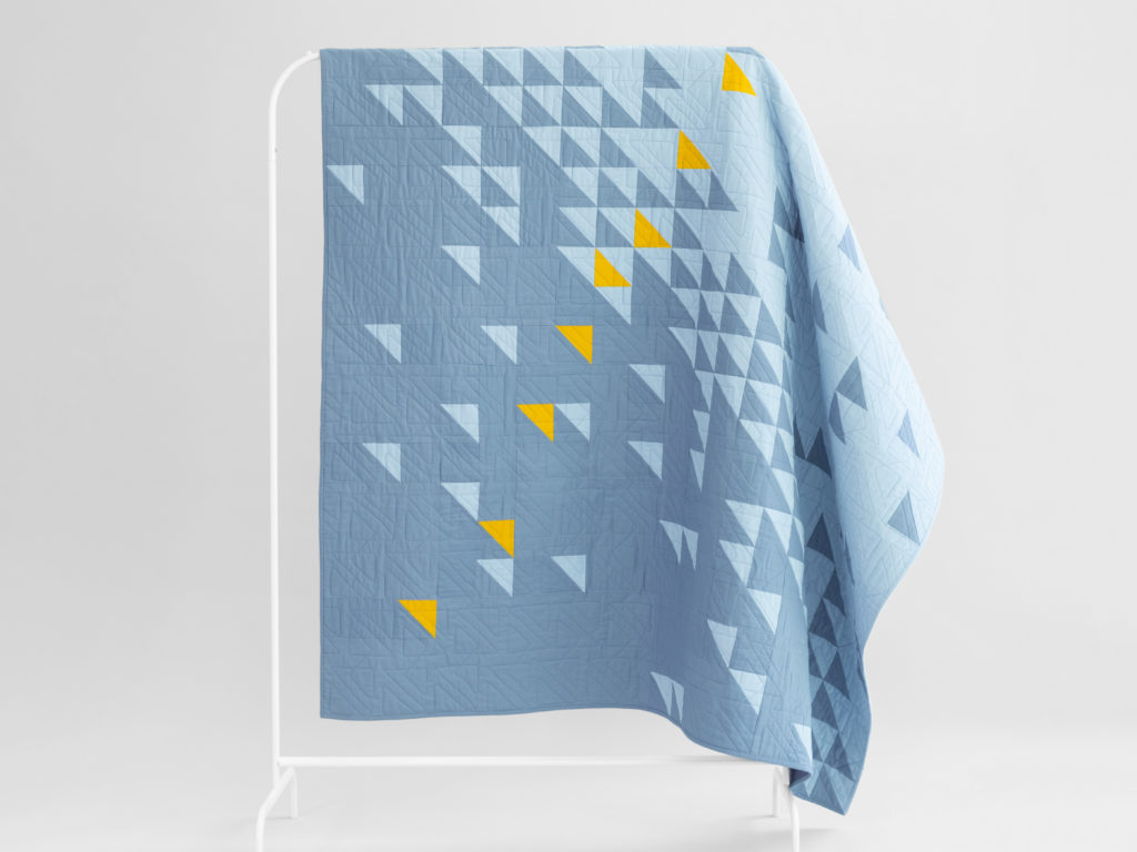
One of the quilts featured on my segment in Patchwork Nation is Meeting of the Geese. My original design for this quilt was grays with a pop of red. As I’ve mentioned before, I usually choose the colors of a quilt after the design, and I spent a great deal of time trying to find the perfect color for this design. In the end, I sort of thought the gray/red was the only color scheme that worked, so when Bluprint (formerly Craftsy) approached me about creating kits in a custom color palette, I thought it would be an interesting challenge to revisit that aspect of the design. In the end, we actually came up with two different colorways that I think both look really great!
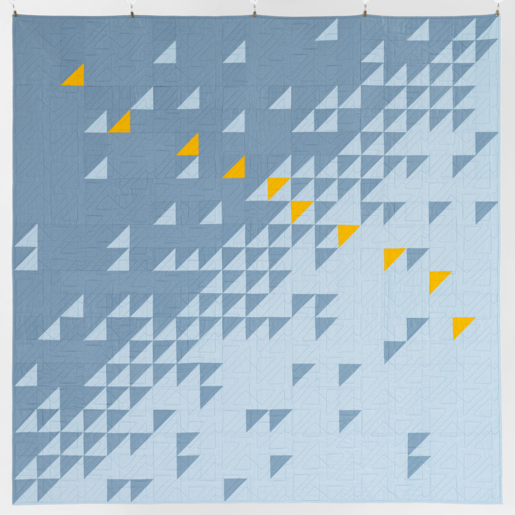
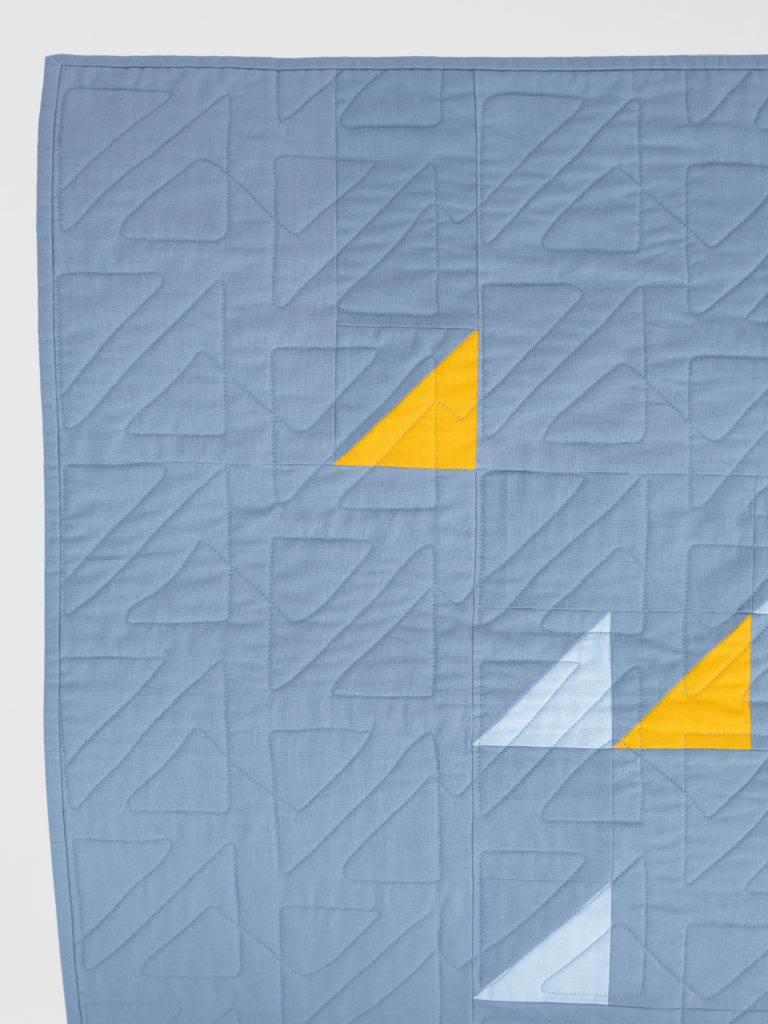
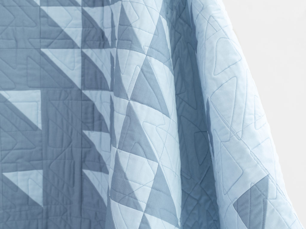
The first colorway is Sky, and I pieced and quilted this sample in blues with a mustard yellow accent. Instead of the matchstick quilting that I did on the original, for this quilt I chose a pantograph with a triangle theme to complement the triangles in the quilt, and I was really pleased to see how well that worked.
The other colorway is Sand, which comes in peachy fabrics (coordinating socks not included).
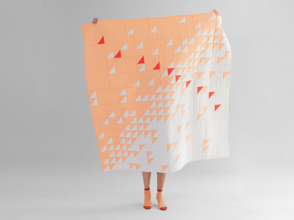
This one was quilted with vertical straight lines, which also looks cool (and is way easier than on the diagonal like my original).
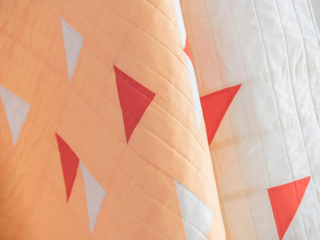
Both Sand and Sky kits feature Boundless solids and include all the fabric for the top and the two-color binding, and they’re available on the Bluprint site now, if either of these colors speak to you!
Disclosure: This post contains affiliate links.

Stunning design and great color choices. Even the socks (Ha!)!!
Very cool quilts!!