You have probably noticed that temperature quilts are all the rage right now—there’s even a special exhibit of them planned for QuiltCon in Phoenix next month. Basically, for one year, you make a block every day that denotes the high and low temperatures of the day using a color gradient. Over the course of a year, you end up with a neat color gradation.
I think many of these quilts are absolutely stunning in their visual impact, but the science side of me doesn’t feel like they convey a whole lot of interesting information, other than the fact that most places have a pretty pronounced seasonal cycle. I’ve been wanting to make a different sort of temperature quilt—one that visualizes climate change, which necessarily involves more than a single year. So my quilt is the quilt version of the Globally Warm crocheted scarf created by my friend Joan Sheldon. Credit where credit is due; this data analysis and the idea of making a fiber art visualization of it is hers, and she kindly gave me permission to make a quilt version.
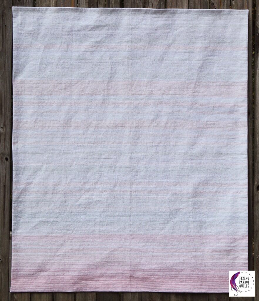
I had been thinking about how to do this for a while, but (perhaps naturally) got kind of hung up on the idea of piecing the quilt and using a different fabric color for each year. In order to keep the quilt to a reasonable size and still include 400 years of data (Joan actually has data going back to the year 200, but 400 seemed reasonable to me too), I either needed to make the strips ⅛” wide, or use some sort of format which wasn’t entirely linear, such as putting squares into rows. The former seemed too daunting technically, and the latter didn’t appeal to me visually. It wasn’t until after I made my ocean circulation quilt that I realized that fabric was not my only option in quilting! There is also thread color! ⅛” spaced stitching felt a lot more doable than strips of that size.
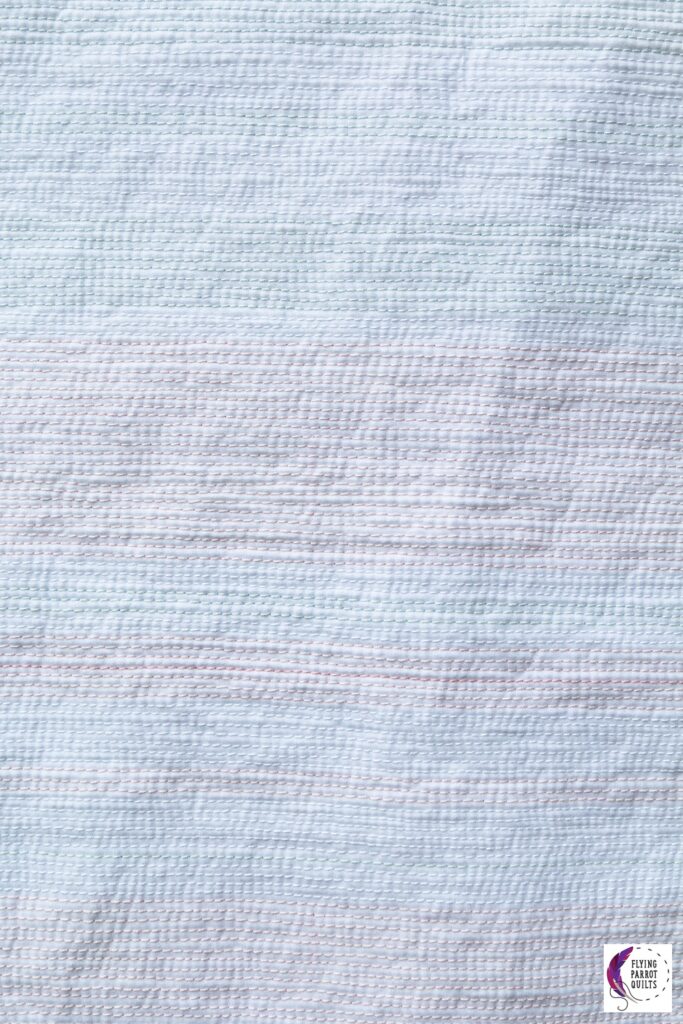
The meaning of each line of stitching
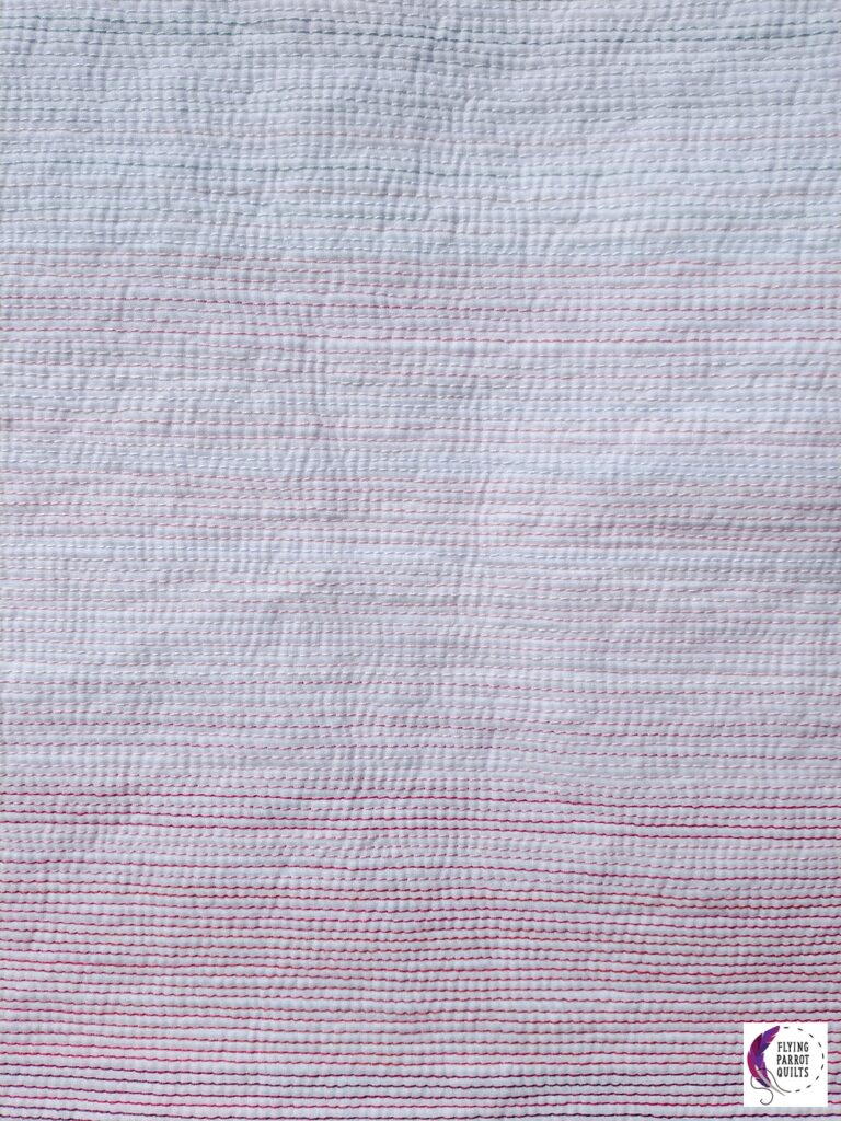
This temperature quilt has 421 lines of stitching, and rather than a day, every line of stitching represents the global average temperature for a single year. The colors were chosen based not on a temperature range, but on how far from the baseline average they are. About average is white, cooler than average is blue, and warmer than average is pink. The bluer or pinker (redder) the color, the further from the average that year’s temperature was.
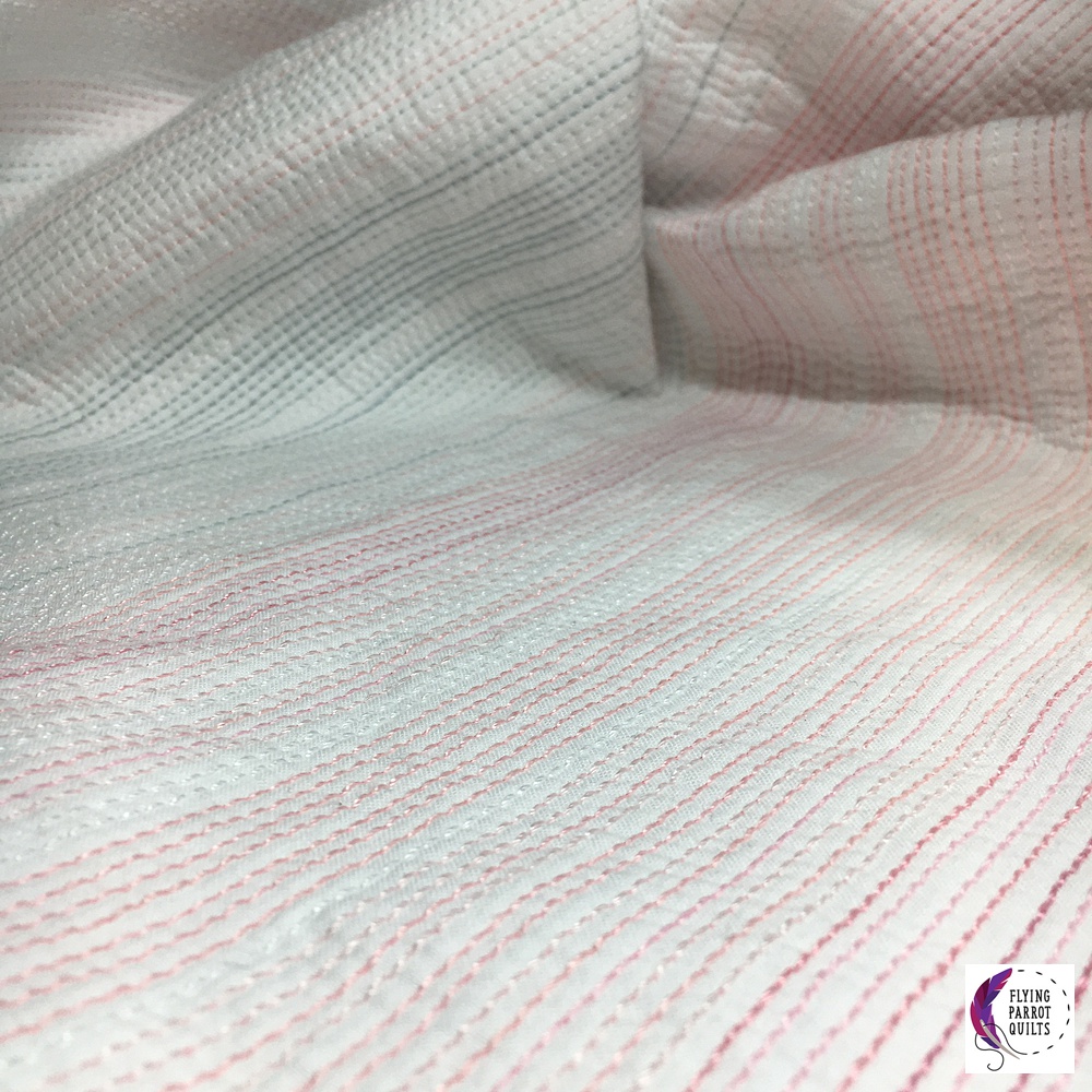
The original scarf used one shade of blue and three shades of red—this was partially due to the limitations of yarn gradations that Joan was able to find. Thread comes in more colors, so I wanted to expand the shading and ended up with 3 blues and 12 reds in addition to the “normal” white. The baseline for both my quilt and Joan’s scarf is 1600-1900, just to have a baseline. I did, however, try the calculation for the whole range of data (1600-2020), and it would have changed very little in terms of the color for each year.
Matchstick quilting
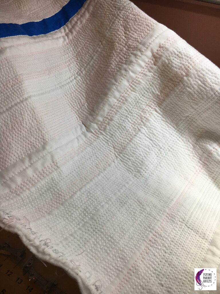
For the actual stitching, I used 12-weight Aurifil thread so that the color would really show. I used 50-weight in the bobbin. I think ideally, I would have used 40- or 28-weight, as the 50 was a bit thin and in a few places there are some tension issues. But I have a lot of 50-weight thread already and I didn’t really want to buy coordinating bobbin threads for all those colors, since buying that whole color range of Aurifil in the first place wasn’t all that cheap. I ended up changing the bobbin thread to red for anything above Warm 4 to indicate that this was where there is no longer a cool equivalent, so there’s a little more scientific information on the back of the quilt. (Sorry, I seem to have neglected to take a good picture of the back!)
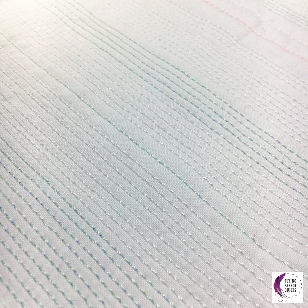
As for all that matchstick quilting, I did it on my domestic machine. I find it very hard to keep straight line spacing consistent on the longarm, and it’s also hard to keep lines parallel as you advance the quilt, so domestic machine quilting seemed easier for this quilt. (There are still issues with spacing in places, particularly as my walking foot needs the needle moved over in order to actually quilt right in between the markings on it.)
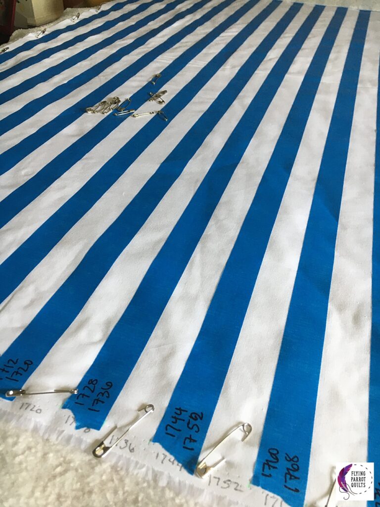
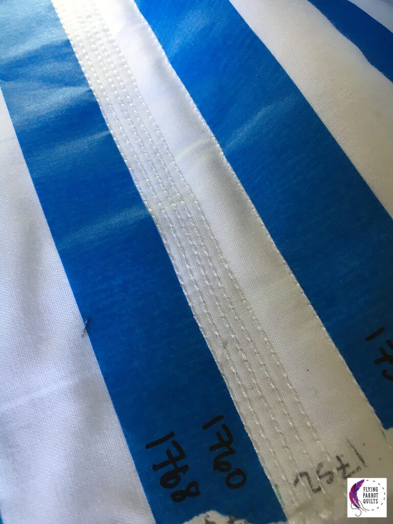
To keep track of where I was on the quilt, I used blue painter’s tape to tape off every other inch of the quilt. Then, I marked on both the tape and on the selvedge edges of the fabric what years that space corresponded to. Combined with a printout of what color was to be used for each year, I first quilted 1 inch apart. Then, I filled in the intervening years by quilting the ½” year, the ¼” years, and finally the ⅛” years. Starting by quilting 1 inch apart helped to stabilize the quilt sandwich, and allowed me to then move around a little more in order to avoid constant thread changes.
Finishing
I finished the quilt with a facing so as not to interrupt the flow of lines. So that there is some reference of which year is which, I made one of the facing sides wider than normal, and hand-embroidered year markings in 20-year intervals onto it, so that you can still find a particular year. I did this by printing out years, tracing them onto the facing (after sewing it to the quilt, so that shifting wouldn’t be an issue), and then embroidering with a simple backstitch using gray 12-weight Aurifil.
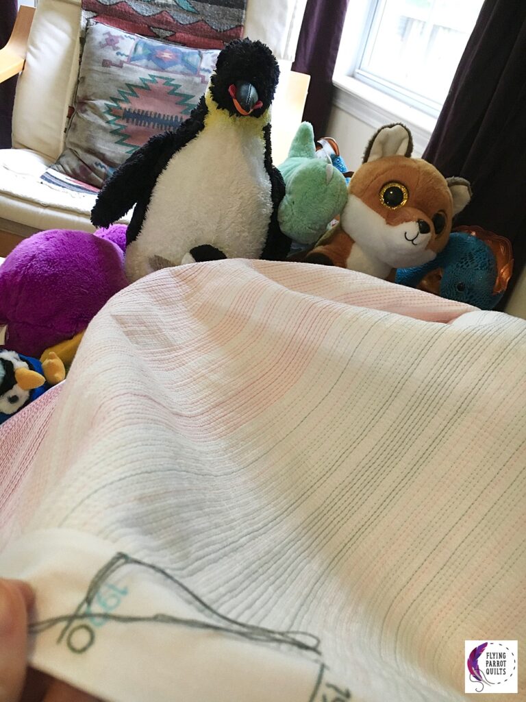
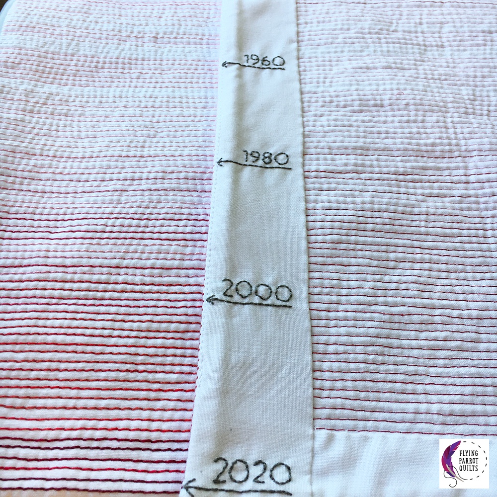
I’ve spent enough time looking at climate change graphs to have had a rough idea of what this quilt was going to look like, but even I was surprised at how the red is really only at the very bottom of the quilt, and how quickly I blew through my range of thread colors there. There’s at least one thread color that I used only for a single line of stitching. Here are about the last hundred years or so:
And if you’ve read all the way to here and want to know I think we should do, my answer is simple. Vote. Yes, there are lots of little things you can do to lessen the environmental impact of your own actions, but we need elected officials who have the political will to wrest us away from fossil fuels to truly tackle this problem. Vote with that in mind. Vote.
VOTE.
If you’ll be at QuiltCon in Phoenix next month, you can see this quilt in person there! It will be hanging in the Minimalist Design category.


I sure hope the omicron surge decreases enough for me to feel comfortable with QuiltCon. o_O I’d love to get the opportunity to see this in person. Thanks for sharing so many details on the science and your methods behind creating the precision in your quilting.
I really appreciate seeing your process, both in where the data comes from and how you turned that into the finished piece. 400 years is a lot of data and a lot of thread!
Wow what a great idea to use thread instead of fabric and incorporating so many years. That quilt shows so much. I too appreciate reading about the process
Just saw this quilt at Quilt Con…wow!…love it. An outstanding piece of work that communicates such an important message in such a subtle way